Hong Kong Island: architectural classics and new projects in the heart of the city
Compressed between the Bay the mountains, the tall and dense Hong Kong Island is full of architectural icons and exciting new buildings.
Hong Kong Island is the postcard of Hong Kong. Its small buildable area compressed between the Bay in the north and the mountains in the south led to development both tall and dense. While Sheung Wang, Central and Wan Chai hold most of Hong Kong’s architectural icons and offer close to zero spaces for new developments, the east side of the island is witnessing changes with new infrastructure projects and buildings.
In this guide, we'll start in the western neighborhood of Sa Ying Pun where you'll find Sou Fujimoto's Potato Head project. We then head to Central, the heart of Hong Kong, where two small art galleries designed by OMA are placed close to architectural giants such as the Two IFC by Pelli, the HSBC Building by Foster and the Bank of China Tower by I.M. Pei.
Further east and up the mountain, you'll find a little building by Gehry, the OPUS Hong Kong, while down at the Bay the Central Government Offices by ROCCO offers a vibrant public park to the city. We'll then finish at KPF's Hysan Place, a large and exciting development in Causeway Bay. As an extra, one feature in Hong Kong I believe everyone should experience: the Mid-Level Escalators.
Map
Black icons are mentioned in the articles, while gray ones are further recommendations (direct link):
Buildings
- Potato Head Hong Kong - Sou Fujimoto
- Edouard Malingue Gallery & Lehmann Maupin Gallery - OMA
- Two International Finance Center (IFC) - Pelli Clarke Pelli
- HSBC Building - Foster + Partners
- Bank of China - I.M. Pei
- Central Government Offices - ROCCO Design
- Opus Hong Kong - Frank Gehry
- Hysan Place - KPF
- Extra: Mid-Levels Escalators
Potato Head Hong Kong - Sou Fujimoto

I was not entirely sure what Potato Head was. A restaurant? Bar? Shop? As the warm host Shazaf explained to me during my visit, it is all of that plus more.
Potato Head is an Indonesian lifestyle hospitality brand expressed through a collective of hotels, beach clubs, and city clubs. Beyond its flagship location in Bali, the brand also has spaces in Jakarta and Singapore.
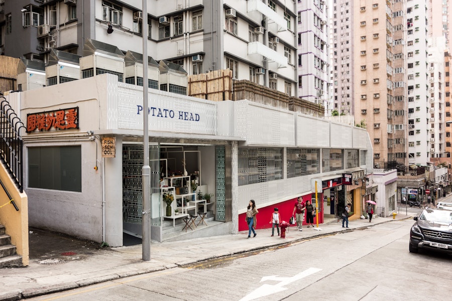
Potato Head Hong Kong stands on a sloped street in the neighborhood of Sa Ying Pun, with a semi-transparent facade displaying an intricate pattern of white lines, inspired by the metal frames found in local windows. Its contents "spill out" on the street from where you can quickly recognize an iconic Fujimoto element: white metal wireframe boxes which form the cafe and shop's furniture, reminiscent of his foray into the Serpentine Pavilion series back in 2013.
The white shop area quickly transitions into a warm, teak covered bar and lounge area, punctuated by hanging reflective planters washed by the filtered light coming through the large windows. People were hanging out on yellow velvet sofas or Marcel Breuer leather chairs giving the whole environment a very welcoming and cozy feeling.
Further inside the surfaces become a beautiful display of delicate engraved wooden panels which cover most of its restaurant, called Kaum. A long wooden table occupies a whole room, while informal seating arrangements fill the second room. One lovely surprise was the music room tucked away in the back and accessible by a series of "secret" passages. It is a lounge space dedicated to music listening and lounging, covered in teak and displaying beautiful seating and wall decorations.
Visit
You can come to shop, drink coffee, eat some food, have a drink, or enjoy some music. Or just to take a peek, already worth the trip. Check their Facebook page for opening hours and other information. The closest subway station is Sai Ying Pun on the Island Line.
Edouard Malingue Gallery & Lehmann Maupin Gallery - OMA
OMA's work in Hong Kong is surprisingly intimate. They tried many times to get large scale projects in the city: the office was finalist in big competitions such as the West Kowloon Cultural District (won by Foster+Partners); or the Border Crossing Facilities next to the airport. The Chu Hai College Campus was destined to be OMA's first large project in Hong Kong but, unfortunately, they somehow lost the commision to ROCCO Design Architects.
What is left are four interior design projects. Two are out of limits to the public (private offices), but two art galleries are open for visitation and carry OMA's signature.

The Edouard Malingue Gallery, located on the 6th-floor of a non-descript building in Central, is a space destined to display impressionist and modernist masterpieces. The gallery is composed of three rooms encased in aluminiun and containing reflective resin floors and white walls, while the building's inner working are left visible on the ceiling, creating a rough but clean appearance. A short five-minute walk away, the Lehmann Maupin Gallery occupies a 4th-floor corner in the old Pedder Building, a 1923 Beaux-Arts "relic" in the middle of Hong Kong Central.
The small gallery is divided into three spaces. The main exhibition room has a square floorplan with a column at its center. While its walls are white and clean, the column was left rough and untreat as found. The second room, separated by a sliding wooden door, provides extra exhbition space or a separated room for private viewings. The third room houses administrative facilities. OMA previously designed Lehmann Maupin branches in other cities, always using their signature plywood coverings and a simple yet precise sequence of spaces.
Visit
Both galleries are very close to each other and also within walking distance to subway station Central. Both are open from Monday to Saturday. Check their websites below for further information on current exhbition and precise opening hours.
Two International Finance Center (IFC) - Pelli Clarke Pelli
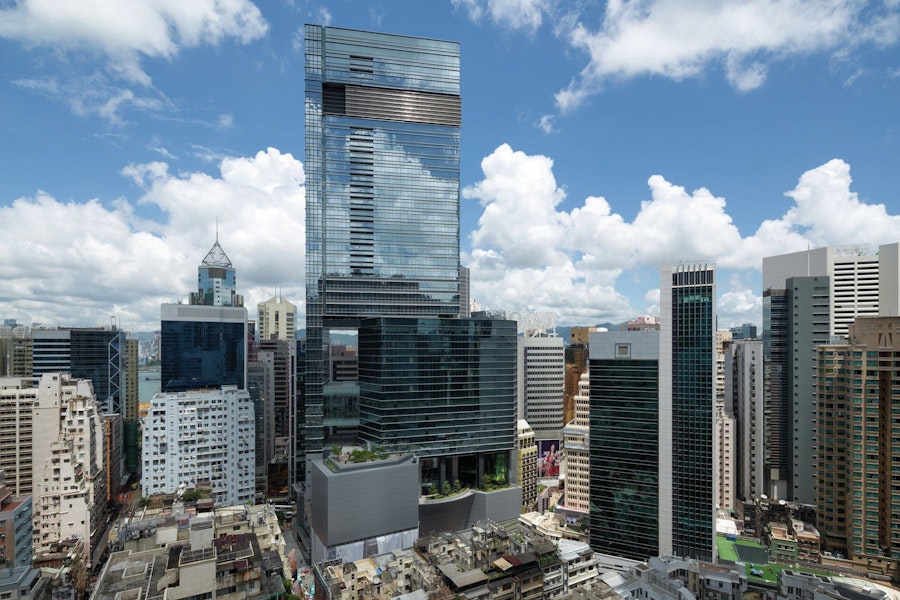
At 415m, it is the tallest building on this side of the city. Its position and height, as well as its distinctive, mech-like crown design, make it one of the most memorable images of Hong Kong.

It is part of the IFC complex which also contains its older but smaller sibling One IFC, the gigantic IFC Mall and a Four Seasons Hotel and Serviced Apartments tower. It is perhaps the most prominent site in the whole island, right on the shore, making it stand out from the sea of high-rises climbing up the Victoria Peak behind it. The Two IFC stands as a simple and elegant building. Its geometry and facade are clean and balanced, supported by efficient structure and circulation solutions. Although both the south and west facades are difectly connected to the IFC Mall, its north and east facades touch the ground and are directly accessible from the street level.
Visit
From the outside, the tower can be appreciated from numerous vantage points. I would recommend approaching it from the north or east sides: standing where the tower actually hits the ground will give you the true impression of its towering heights. Another interesting viewpoint it from the rooftop of the IFC Mall, a landscaped area accessible from the Mall. Unfortunately there is no public observation deck on the tower tip. However, you can visit the Hong Kong Monetary Info Center located on the 55th floor. More about it on the Bonus chapter of this guide (coming soon!).
HSBC Building - Foster + Partners

This is by far my favorite building in Hong Kong. Foster's HSBC Building is a classic built over 30 years ago and unique until today. It certainly deserves its own post: The greatest building in Hong Kong: HSBC Building by Foster+Partners.
Visit
It is the headquarters from HSBC in Hong Kong, so most of it is inaccessible to the public. However, on weekdays the bank on the first floor is open and accessible by going up the escalator under the building. There is also a permanent exhibition on display on the plaza below it showing the history of the bank and the building. However, you'll also want to visit the building on a Sunday to see it being used by an unexpected public: the Filipino maids, using the HSBC plaza as their living rooms, eating, sleeping, playing games, and just relaxing on their time off.
Bank of China - I.M. Pei

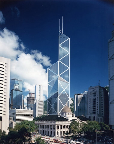
The Bank of China Tower is one of the most recognizable buildings in Hong Kong. Its triangulated facade with white lines on dark reflective glass delineates its particular geometry and structure. Four triangular prisms going up at different heights generate a floor plan variation that goes from a full square at the base to a small triangle at the top. As the prisms end they create atriums that bring natural light to the interior of the tower base.

An interesting side story is the building's relationship to Feng Shui. Its sharp angles and edges pointing out to the neighboring buildings are perceived as acts of aggression against the bank's competitors. A famous reaction was HSBC Building's late remodeling of its roof in an effort to counteract such aggressiveness: it installed two extra BMU machines resembling cannons pointed at the Bank of China Tower to neutralize its negative Feng Shui effects.
Visit
As with the HSBC Building, it is the headquarters of the Bank of China, so most of it is inaccessible to the public. During the week, the ground floor is open and even has a Starbucks inside. By taking a set of escalators, you'll reach the bank hall. It is a high, large open space housing a branch of the bank, from which you can look up the tower's central atrium. An observation deck used to occupy one of tower's high floors, but it has been long closed.
Central Government Offices - ROCCO Design

The HKSAR Central Government Offices is an administrative building like no other I've ever seen. While in mainland China all administrative buildings are fenced-off "castles" where the ordinary people have no place, this building by ROCCO Design tries to offer the opposite. The most striking feature is the park that cuts right through the building. Symbolizing a "door always open," the main building is composed of a rotated block under a fixed frame, opening up to the harbor. It allows not only people to go through but also avoids blocking the sea winds getting into the city. The park extends all the way to the seaside promenade, flanked by the Legislative Council Complex and the Chief Executive’s Office on both sides.

It is massive and impressive, but also friendly and approachable. It is nice to see how architecture ideas can reach their full potential even on sensitive buildings such as government headquarters.
Visit
You can walk all around the building and enjoy its park 24/7. Events are occasionally held in the park especially in Summer.
Opus Hong Kong - Frank Gehry

Gehry's first residential building in Asia, the OPUS in Hong Kong is supposed to be the most expensive address in the city. I only saw it from afar, perched on the hills of the Happy Valley, and you could easily guess it's a Gehry building if no one told you so. It is hard to judge its qualities without experiencing its interior spaces, which most of us mortals will never get to do. It is a fantastic location, with unobstructed views of the city and the Bay, surrounded by jungle reserves, isolated from other high-rises. It looks like tubes bundled together, forming misaligned balconies and bay windows. The stone clad base and service areas provide an interesting contrast to the glass and glass-encased (!) metal columns. To me, over-the-top and complicated.

Visit
You can walk by the street or check it from the city, as getting in to take a peak will require good connections or an invitation from the British consulate.
Hysan Place - KPF

KPF's shopping mall and office tower in Causeway Bay is a striking building. Located on a busy road in a tight plot, it rises tall parallel to the street as a series of blocks layered on top of each other. Long escalators zig-zag on the facade of the lower podium, taking you from the ground floor up to level 17 in four flights. Yes, these are 17 levels of shopping, not always exciting, but culminating on a huge bookshop occupying the top four floors. The stacked blocks have different dimensions creating big openings in the building mass. This provides good airflow to reduce downwind and offers sky-gardens to the users. It is the only building in Hong Kong with a LEED Platinum Certification.

Visit
It is a giant shopping mall, so you can go and explore during regular business hours. The bookshop Eslite is a fine shop to check, and the food offerings are also enticing. Make sure to go up the facade escalators and to visit the sky-gardens. Great views of Causeway Bay and surrounding neighborhoods.
Extra: Mid-Levels Escalators
Hong Kong is a hilly city, with very steep streets and stairs going from Central to the last residential high-rises up the hills of Victoria Peak. In an attempt to alleviate car traffic in the city, this unconventional urban intervention was proposed, approved and built in Hong Kong, and became the longest system of outdoor covered escalators in the world.

That alone is so unique. The system works downhill in the morning, taking commuters from the upper residential areas down to the business center of Hong Kong. After 10 am, however, it works exclusively uphill, providing an easy and fast way for people to go back home. Despite early critics, it became hugely popular, attracting not only residents but also tourists. But most incredible was the way it affected its direct surroundings. It creates a second level of shopfronts and business on higher floors of its neighboring buildings, aligned to the escalator's level; a three-dimensional commercial revival, a new public level in the city's fabric.
Visit
It is a must-experience, something you can only see in Hong Kong. Check out the site Hong Kong Extras for a detailed guide of the escalators, including a little map.