The new architecture of Kowloon and beyond
Kowloon and the New Territories are currently Hong Kong’s largest architecture playground, with new buildings and daring urban development plans such as the New Central Business District in Kowloon East, or the Kowloon West Cultural District.
When crossing the border between mainland China and Hong Kong, you'll first pass through the New Territories and the Kowloon Peninsula before reaching the Bay, across which you'll find Hong Kong Island. The New Territories is the largest of Hong Kong's three regions and houses over half of its population.
A Large part of it, however, is reserved for parkland and rural areas, beautiful mountains and sprawling jungle protected by the government. The urban areas are concentrated along the shore. Also, many of Hong Kong's famous islands, such as Lantau Island, belong officially to the New Territories. The Kowloon Peninsula is the dense area between the northern mountains of the New Territories and the Bay. It is the most populous region in Hong Kong, characterized by large residential blocks and extreme population density. Due to its proximity to the old Kai Tak Airport, building height was for long limited, which resulted in its much lower skyline when compared to Hong Kong Island. While the latter is the proud home of shiny skyscrapers, Kowloon is home to the grungy and grimy Hong Kong scene.
Map
Black icons are mentioned in the articles, while gray ones are further recommendations (direct link):
Buildings
- Hong Kong Airport Terminal 1 - Foster + Partners
- Jockey Club Innovation Tower - Zaha Hadid Architects
- International Commerce Center - KPF
- Honk Kong Design Institute - CAAU
- 133 Wai Yip Street - MVRDV
- Mongkok Residences (Composite Building) - Aedas
- Chu Hai College Campus - ROCCO Design Architects
- Run Run Shaw Creative Media Center - Daniel Libeskind
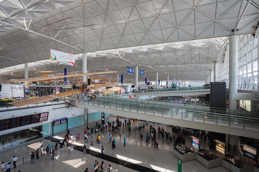
Hong Kong Airport Terminal 1 - Foster + Partners
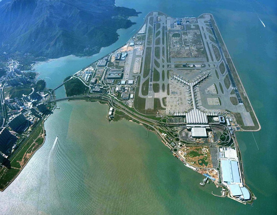
Completed in 1998, the Chek Lap Kok Airport is one of the world's largest. The airplane-shaped Terminal 1 was designed by Foster, while Aedas and SOM designed the later Terminal 2. Terminal 1 is beautiful. The light roof construction, engineered ARUP, consists of a series of arching ribs, extending across the check-in area, and out to the departure gates. The ribs intercalate with longitudinal openings to bring light into the cathedral-like. It is crafted with such attention to details, the ceiling cladding aligning precisely with the windows, the rhythm and direction of the structure flowing along with the interior passenger traffic. It is a simple system, beautifully executed.
Foster is a master of building airports. Every time I pass through the Beijing Capital International Airport, designed by the British architect, I marvel at the gentle sloped vast yellow roof, looking like the back of a dragon, the triangular roof windows resembling its scales, gently welcoming and sheltering the departing passengers crossing though its tall glass facade. I always gawk at the vast expanse of the main terminal, the smooth ceiling marked with rhythmic cladding lines, supported by large tapering red columns, through which light from the roof windows shines through inundating the space. Even in your hurried in or out of the airport, make sure you don't forget to pay a little deserving attention to this building.
Jockey Club Innovation Tower - Zaha Hadid Architects
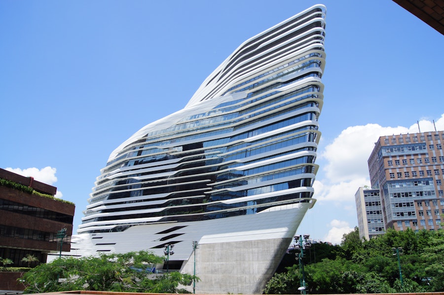
I was extremely disappointed by this building. I had high expectations to see the irregular shaped tower, skewed as if about to leave its site at any moment, with its striped facade and spaceship-like interior spaces. But what I saw was a mess of badly executed concrete and stucco, dirty and falling apart metallic louvers and panels, oddly-shaped tight interior spaces crammed with irregular narrow staircases, convoluted circulation concept mixing ramps, escalators, elevators, and dead ends. I lost my orientation inside of it many times and got constantly let down by promising voids and atriums that never delivered.
I usually like Zaha's buildings. The few I visited (Galaxy and Wangjing SOHOs in Beijing, Serpentine in London, MAXXI in Rome, Vitra Fire Station in Weil-am-Rhein, among others) always left a strong impression. But this one was, IMHO, a pain to look at.
Visit
The Innovation Tower is part of the Hong Kong Polytechnic University Campus. It is a teaching building, so it is open all the time. You can circulate freely throughout the building. The closest subway station is Ho Man Tin, on the Kwun Tong Line. The best way to reach it seems to be by bus, as the busy Hung Hom Terminal is right next to the campus.
International Commerce Center - KPF
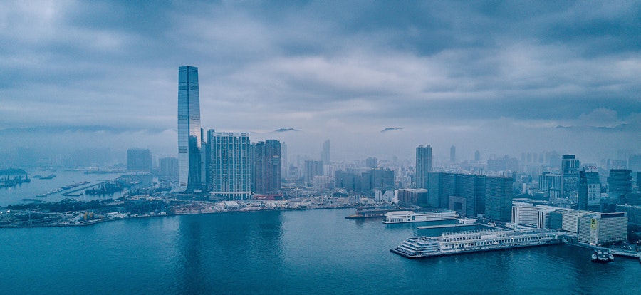
The tallest building in Hong Kong was supposed to be even higher, which was impeded by a sensible local regulation that does not allow buildings to be higher than the surrounding mountains. So, instead of almost 600m, KPF's International Commerce Center (ICC) was built 484m-high on the new Union Square reclamation area, master planned by TFP Farrells.
Seen from across the Bay on Hong Kong Island, the tower's facade stands out. Its four faces do not meet at the corners, and also seem to "peel-out” on the top and bottom of the building. This move improves the tower’s aerodynamics, mitigating the effect of Hong Kong’s strong winds and occasional typhoons. A silver coating on the glazing makes it highly reflective, shimmering on sunset and sunrise when it reflects the low sun. A closer look reveals that the facade folds out at the base to form entrance canopies. Nicknamed “the Dragon Tail,” the north canopy extends further out to cover the metro plaza, integrating the tower with the Kowloon Station. It is, however, hard to approach the tower.
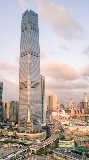
Surrounded by large overpasses and roads, and standing on top of a parking garage, the tower is an island within an island. Union Square received criticism by forming an isolated ensemble of tall luxury towers isolated from its surroundings. Hope is that the new Kowloon Cultural District which is in full construction between Union Square and the bay will better integrate it.
Visit
You can check the tower’s hotel lobby, or have an expensive drink at its Ozone Bar on the 118th-floor, named the tallest bar in the world. There is a 360-degrees observation deck called Sky 100 for which you can purchase tickets either online or at the venue. The base of the tower connects to a luxury shopping mall. You can reach it via subway, Tung Chung Line, Kowloon Station, which is also a stop on the Airport Express Line.
Honk Kong Design Institute - CAAU
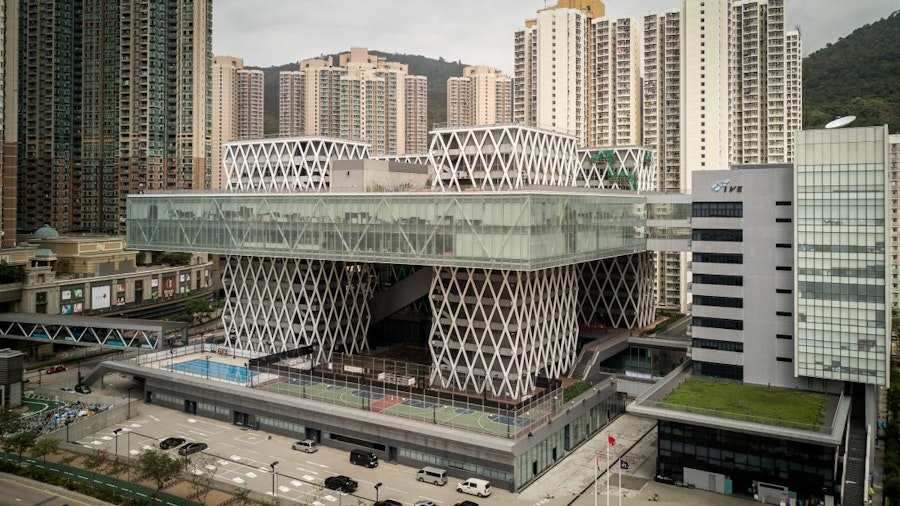
Although I have my reservations, this building was a good surprise to me when I visited it. It is a building like no other I've ever seen: a large two-floor box raised high above the ground and at the same time perforated and supported by four massive "pillars" wrapped in white diagrid tube structure. A long, 60-m escalator starts on the lower level and takes you directly up the underbelly of the elevated box. If you choose not to go up, a vast semi-underground plaza extends under the box, among the large pillars, which in turn house programs such as a gallery or a conference center. Although it sounds very complicated, it is easy to navigate.
Unfortunately, the 60m-long escalator was closed for repairs at the time of my visit, but it takes only a brief elevator ride to reach the top of the box. In the damp Hong Kong weather, the roof seems to be better suited for night strolls. But the view of the bay is striking, and is was fun to walk around the area overlooking every now peeking into the vertiginous voids of the structure. The box houses classrooms and workshops and is pretty straightforward except for the voids that allow you to look at the public plaza on the ground floor, which is by far the most lively and exciting part of the project.
Among and in the giant pillars, a public plaza connects the HKDI Gallery, which regularly hosts design and architecture-related exhibits (Konstantin Grcic's was on when I visited it, Rafael Moneo's had just ended). There is a conference center right across the gallery, and a new space next to it, housing another exhibition space. A Cafe and other facilities complete the area. The plaza is protected from the elements and feels airy, a constant breeze blowing through.
Visit
It is a university building, so it is open all the time. You can walk freely in the public plaza and visit the galleries. The rooftop and classroom areas seem to be out of reach if you are not a student, but you can reach it with a simple elevator ride, no questions asked. Do check the roof. The HKDI is located right at the Tiu Keng Leng station, lines Kwun Tong or Tseung Kwan O.
133 Wai Yip Street - MVRDV
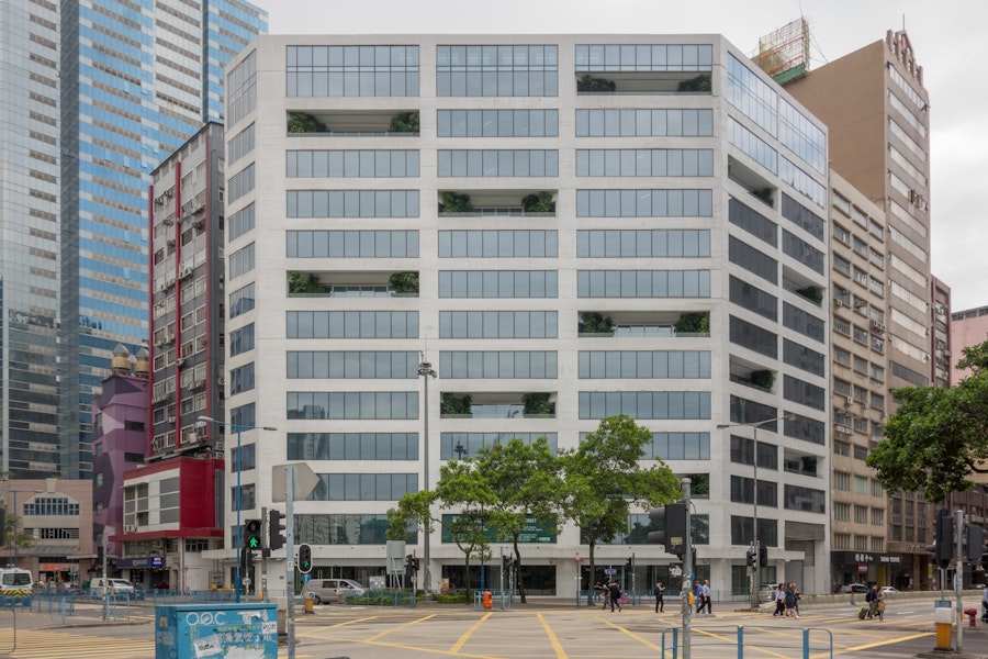
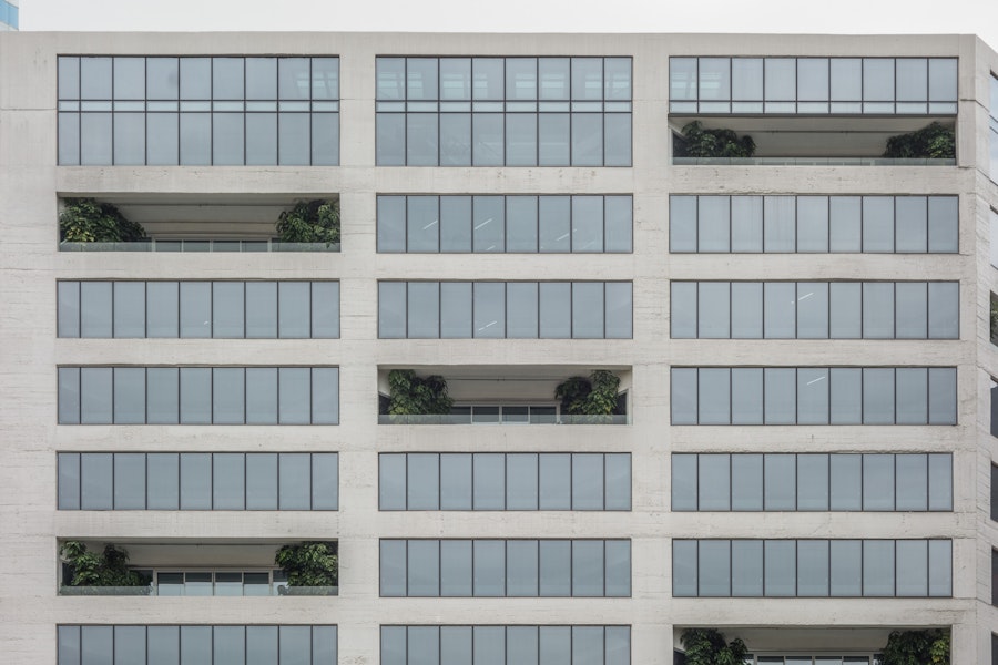
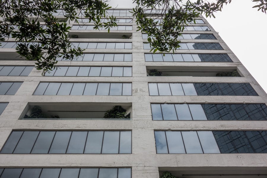
Part of the East Kowloon renovation and conversion from its post-industrial past to become the Hong Kong’s New Central Business District (CBD 2), this building from MVRDV stands as its first showpiece. The Dutch architects stripped the old building down to its structure. By using a mix of white painted concrete and glass, they chose to leave most of the technical installations visible, while creating large loft-like spaces for its future inhabitants. The facade is a simple series of large glass windows sitting flush with the concrete, intercalated by the occasional balcony. The ground and top floors are meant for public functions such as shops and restaurants. What got most of the media’s attention was a concept office model made entirely of glass which MVRDV created to emphasize the idea of the transparent building.
Visit
When I visited it had just inaugurated and was empty, so I could not visit it. But it seems to be a great addition to the neighborhood and will certainly become an attractor point to new business. You can reach it by subway, Kwun Tong Line, Ngau Tau Kok Station.
Mongkok Residences (Composite Building) - Aedas
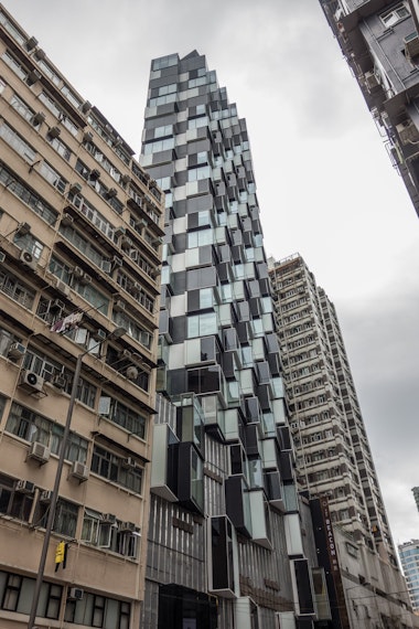
The almost-finished Mongkok Residences, from Aedas, stands in the middle of a street block in Mongkok, one of the busiest areas in Kowloon. It is a tall and slender building with a “pixelated” facade composed of rotated windows resembling rotated cubes. The goal is to offer the best views to its inhabitants while creating a referent to the typical Hong Kong apartment blocks with their protruding balconies and animated facades.
Visit
It was still under construction when I visited it. The ground floor will be commercial, but the tower is residential. However, just passing by to look at how it stands in the middle of Mongkok is already worth the trip. You can reach it via subway, Mongkok Station, Kwun Tong or Tsuen Wan lines.
Chu Hai College Campus - ROCCO Design Architects
OMA's renderings for the Chu Hai College Campus were on our wall as a reference to several projects. The idea was beautiful: two parallel slab buildings connected by a platform composed of program mixed with landscape and circulation, slanted towards the sea offering sweeping views of the water. The facades on the slab blocks were transparent, displaying the life in the building and absorbing the life in the platform. It was simple and powerful.
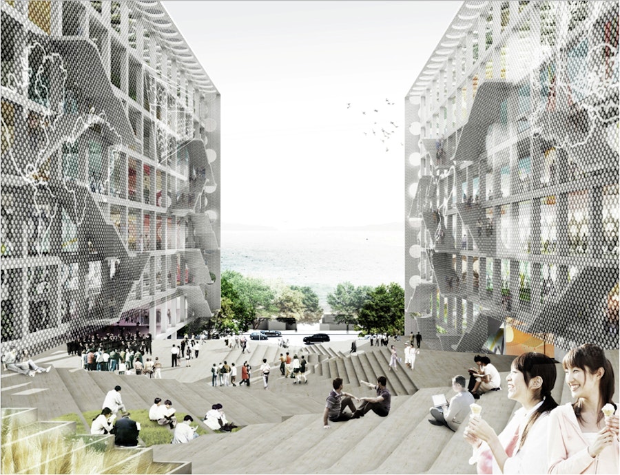
There was the eventual ground-breaking ceremony, and the project was completed in 2016, but somehow no pictures were published, and the inauguration went silent. I was very curious to see it and went on a one-hour bus ride out of Central Hong Kong to reach it on the western shore of the New Territories.
While visiting it, I was just confused. You can still recognize some of the original design in it: the parallel slab buildings are there, but their simple geometry changed into a pile of boxes, inclined facades, and extreme overhangs. The slanted platform in between is also there, but it is now just a roof with some staircases and vegetation. The view is also there but half blocked by two large diagonal bridges which had no place in the original design.

I later learned the building now standing was not OMA’s design. Online gossip says OMA’s was decommissioned due to cost concerns, and ROCCO Design Architects developed new project. It is not a horrible building, but it is not what it could have been. It somehow feels like a missed opportunity.
Visit
Although a long ride, you can reach it easily by bus from Hong Kong Island or Kowloon. It is a university building, and the public areas are easily accessible. However, if you go on a weekend like I did, you won't be able to enter the building unless you trick security.
Run Run Shaw Creative Media Center - Daniel Libeskind
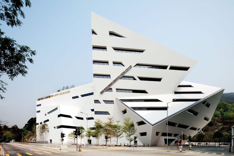
I am on the fence with this one. I admire Libeskind's idea to create unique, challenging spaces to inspire students to be more creative and break out of the norms. But at what cost? The building clearly stands out. Located on the hills of Kowloon, it is unlike any other building with its white interlocking pyramids and cubes and prisms. Daring slanted overhangs, facades, and roofs are cut by regular horizontal windows mounted on black frames. It is all black and white.
The interior also has its moments. The central atrium works together with resting/study areas to create the public "spine" of the building. There is a certain cavernous feeling to it, very cut-off from the outside world by thick walls with narrow windows. The public atrium culminates on a roof terrace overlooking Kowloon, the Bay, and Hong Kong Island. Such magnificent view left me wondering why we only notice it when out on the terrace. The stucco of all its walls is better executed than in Zaha's Innovation Tower. However, there is still some noticeable unevenness that makes me question why such low-tech material was chosen to cover such a building whose sharp lines and angles are its main features.
Visit
It is a university building, open to the public. Try to go during the week, as the roof terrace closes on weekends.