Up north along Friedrichstraße
An architectural tour through Potsdamer Platz and the Kulturforum, regions which represent the reunification and rebirth of the city.
Friedrichstadt and the Friedrichstraße
The next group of building in the Berlin Contemporary Architecture Guide is located around an area called Friedrichstadt. If you look at a map of Berlin at the time of the planning of Friedrichstadt, you’ll see a strong contrast between the organic layout of the city’s older parts and the orthogonal layout of the then-new neighborhood.
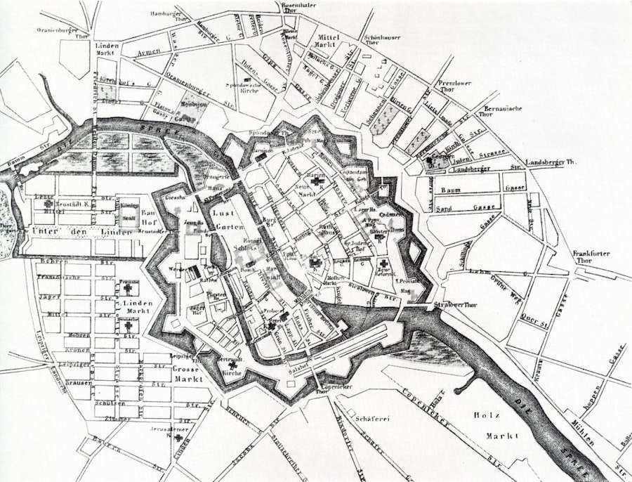
The main street, Friedrichstraße, cuts the neighborhood from south to north, where it extends beyond Friedrichstadt all the way up to Oranienburgstrasse. The street, along with the whole region, was a busy commercial center pre-War. As much of Berlin, it was destroyed during the War. It became a mixture of wasteland and residential buildings in the post-War years. To add insult to injury, the Berlin Wall cut the neighborhood in half until its fall in 1989. In the period post-German reunification, Friedrichstadt was one of the first regions of Berlin to suffer gentrification. Old, cheap residential blocks gave way to commercial developments which brought back the neighborhood to its early status of a luxurious shopping district. With it came the tourists. Nowadays, it is now a lively place by day, quite deserted by night.
The tour
Friedrichstadt is filled with some important buildings completed in the past 30 years. We will start where the last part of the Guide stopped, south of Potsdamer Platz. From there we’ll go further south, checking out an early building from Zaha Hadid and Daniel Libeskind’s epic Jewish Museum. Going back north, an office tower by Sauerbruch Hutton, residential blocks by Aldo Rossi, and a department store by Jean Nouvel will lead us north along Friedrichstrasse. Finally, even though already out of Friedrichstadt, but still along Friedrichstrasse, we’ll check a beautiful library by Max Dudler and end up inside a bunker looking at some cool contemporary art.
Map
Black icons are mentioned in the articles, while gray ones are further recommendations (direct link):
Buildings
- Stresemannstraße 105-109 / Zaha Hadid Architects
- Topography of Terror / Heinle, Wischer und Partner Freie Architekten
- Jewish Museum Berlin / Daniel Libeskind
- GSW Headquarter / Sauerbruch Hutton Architects
- Quartier Schützenstraße / Aldo Rossi
- Galeries Lafayette / Jean Nouvel
- Jacob and Wilhelm Grimm Center / Max Dudler
- Boros Collection / Realarchitektur
Stresemannstraße 105-109 / Zaha Hadid Architects
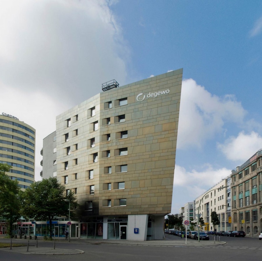
Let’s start this guide with a curiosity: the only building by Zaha Hadid in Berlin. It is also one of her first built projects, together with the Vitra Fire Station in Weil-am-Rhein. This building on Stresemannstraße was part of the Internationale Bau Ausstellung 1987, an effort initiated by Josef Paul Kleihues as an attempt to showcase the latest advancements and thinking on housing developments in West Berlin. It is a 6-story residential block, clad in bronze, standing on a corner next to Potsdamer Platz. Here, you can recognize some of the characteristics that marked her early years: sharp corners and edges that are reminiscent of much of her unbuilt deconstructionist designs.
Topography of Terror / Heinle, Wischer und Partner Freie Architekten
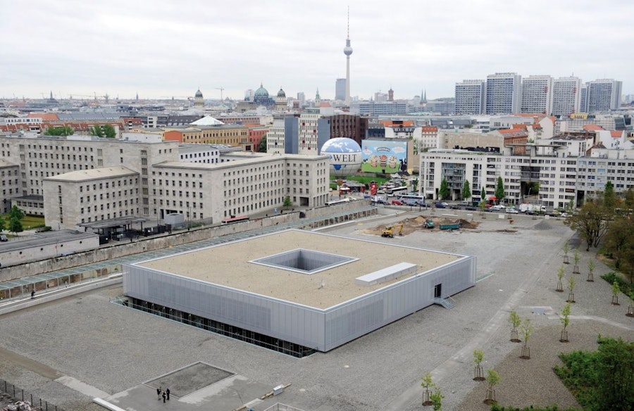
This is a simple building: a flat square, one floor high, with a semi-transparent facade of glass and metal mesh, standing alone on a large site, surrounded by a field of gray stone. The bleak setting presents a heavy chapter of German history to its visitors: the development and functions of the security apparatuses during the Nazi regime. It stands, nonetheless, exactly where the former Gestapo headquarters stood.
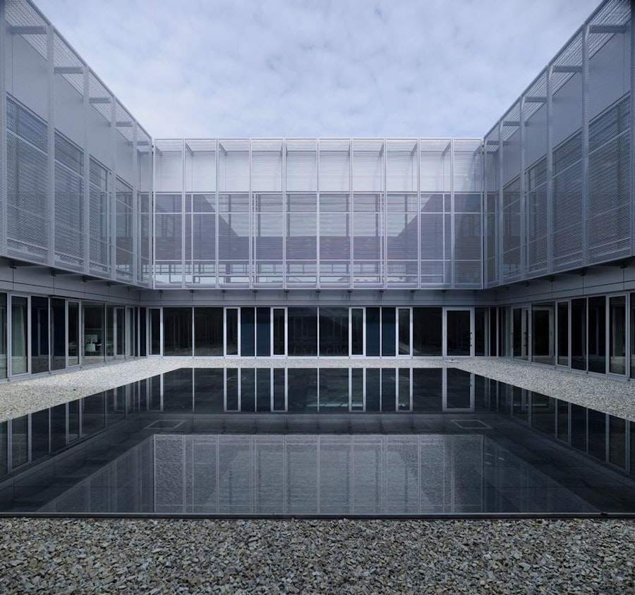
Yet, things could have gone very differently. It is impossible not to evaluate what is there today in light of what could have been. In 1993, Peter Zumthor won a competition to build the Topography of Terror museum on the site. His building had a very different intention. It tried to convey feelings and experiences through its architecture. His design consisted of a long and tall rectangular box formed by a screen of thin concrete columns. The model pictures and other details are beautiful. Unfortunately, due to funding issues, the construction was stopped just after the concrete cores were finished. They stayed on the site for over ten years as a reminder of a building that would never exist.
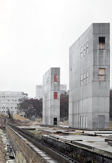
Later they were torn down to give way to the current design. The existing building was also the result of a competition back in 2005, completed five years later. A much humbler approach to the brief, a nice building. But that’s it, just “nice.”
Now head south to check the Jewish Museum, by Daniel Liebeskind. On the way, take a look at Aldo Rossi’s Apartments in Sudliche Friedirchstadt. We will check another development from the Italian architect later on in more detail, but this is also a cool one. It carries a lot of Rossi’s signature post-modernist style. Not my taste, but worth a look.

Jewish Museum Berlin / Daniel Libeskind
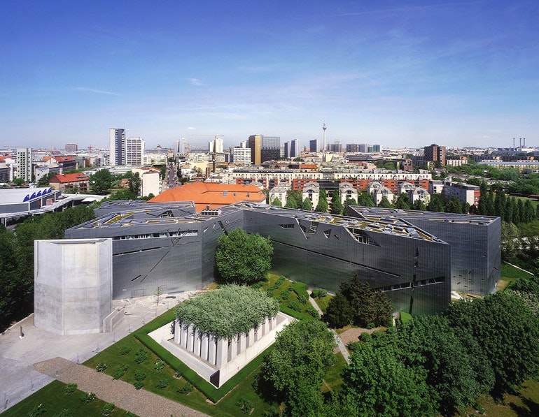
I remember coming to Berlin for the first time and going to this museum. I had studied it in school and heard so much about it from friends who visited it before.
The expectation was high. And, same as with Berlin itself, it surpassed my expectations. I left stunned and humbled at how powerful architecture can be, how space can shape your feelings, and how complexity can be manipulated to bring out powerful emotions.
This building started from a competition back in 1988. Libeskind came out as the winner, and the museum opened 12 years later. The goal was to bring the Jewish presence back to the city and to establish a new identity for the museum in Berlin.
Libeskind used his architecture as narrative and emotion. It tries to express the feelings of absence, emptiness, and invisibility, through a series of unique spaces created to present the effects of the Holocaust. Telling too much would spoil the surprise.
I recommend you go there, do not read anything about it and only experience the space. Oh, and the exhibition is cool too!
GSW Headquarter / Sauerbruch Hutton Architects
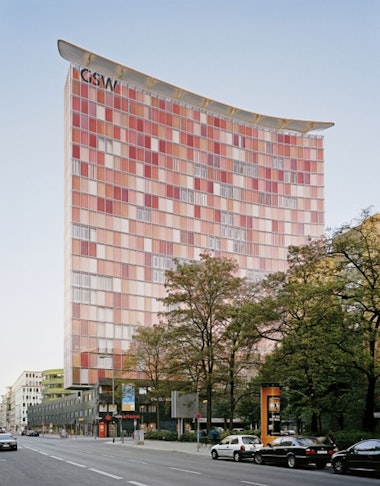
One of the few office towers in Berlin and one of the most distinct. Its wing-shaped floor plan and detached core create a tower that is both wide and thin. It is one of five separate volumes that compose the development. An existing office tower from the 50s connects to the new tower on the east side through its core. Two low-rise blocks, on top of which both the tower and a smaller oval building stand, occupy most of the street front.
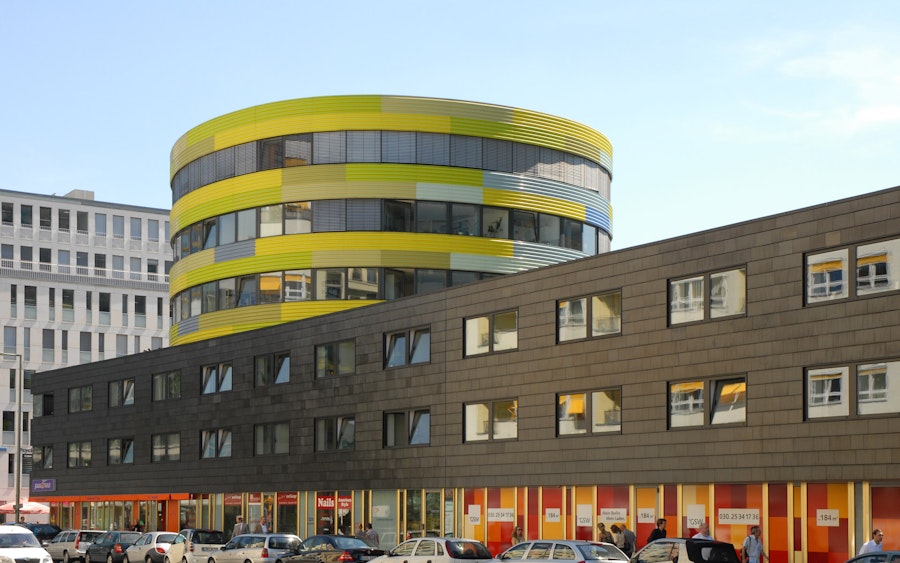
Sauerbruch Hutton’s signature play of colors makes the whole development much light and playful. The wide west facade of the tower is an ever-changing canvas. Its system of red and pink window shades transform the tower as its occupants adjust for sun protection. The double glass facade also helps make this one of the earliest examples of low-energy buildings in Europe.
Quartier Schützenstraße / Aldo Rossi
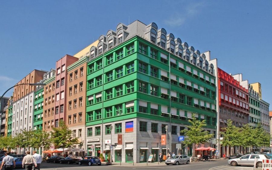
The next building on our list is actually a whole city block. Designed by Aldo Rossi (and inaugurated the day after his death, coincidentally), the Quartier Schützenstraße was part of the reconstruction efforts in the period after German reunification, occupying a previous wasteland from the Berlin Wall. The general planning demanded that new buildings followed the pre-War form of the neighborhood, with low-rise, courtyard-typology developments. For that, Rossi created a series of twelve buildings surrounding four courtyards. The facades vary both in form and in color. By not aligning them to the building divisions, Rossi creates a strategic juxtaposition in an attempt to link past, present, and future. Further historical references are found in the historical remains integrated into the development, as well as in a shortened reproduction of Michelangelo’s Palazzo Farnese in one of the facades.
It is all amusing but almost funny. The pastiche effect does create something unique when comparing to the tedious housing development in the neighborhood. Some of the spaces are quite striking, such as one of the courtyard with its octagonal shape (itself also one of Rossi’s historical references).
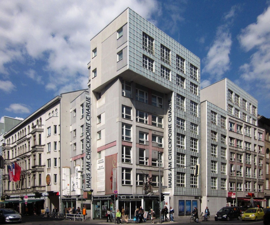
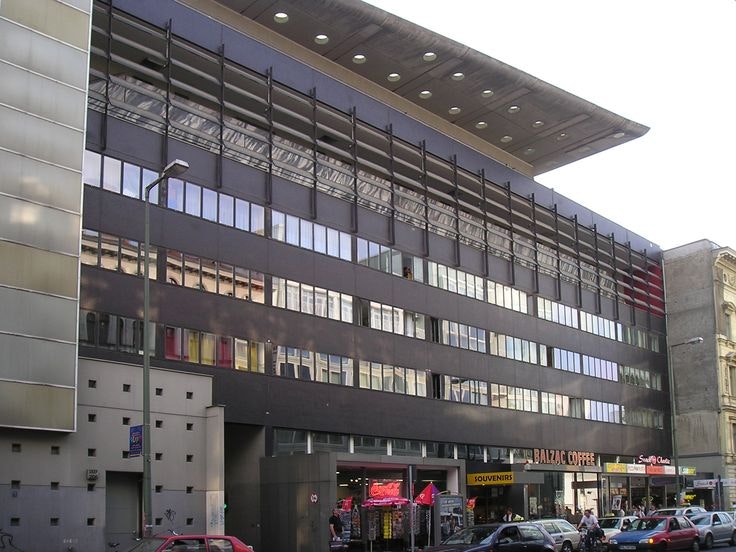
By now you probably already crossed the Berlin Wall line marked on the floor many times. This area of the Wall around Friedrichstraße has an extraordinary history. Here you’ll find the Checkpoint Charlie and a series of indoor and outdoor monuments and museums. It is one of the busiest touristic spots in the city. But as we are here for the architecture, keep an eye for two buildings around the Checkpoint Charlie, one by Peter Eisenman and the other by OMA. They are both not that impressive, very early works of both practices. Also, both are part of the IBA 87 and the reconstruction efforts after the reunification.
After spending time around Checkpoint Charlie, head north on Friedrichstraße. You’ll pass by a building from Phillip Johnson on the west side, out of which the most interesting part is actually the West entrance plaza. There, you’ll find the sculpture Houseball from Claes Oldenburg and Coosje van Bruggen, as well as a wireframe model of the Bethlehem Church, destroyed during the war. Johnson’s building is actually quite an eyesore, IMHO.
Further north, you'll pass by a building from Pei, Cobb & Partners. It is not a very nice building, except at night when its illuminated facade is quite a sight. It is part of three interconnected buildings built at the same time along Friedrichstraße, the third of which is our next destination: Jean Nouvel’s Galeries Lafayette.
Galeries Lafayette / Jean Nouvel
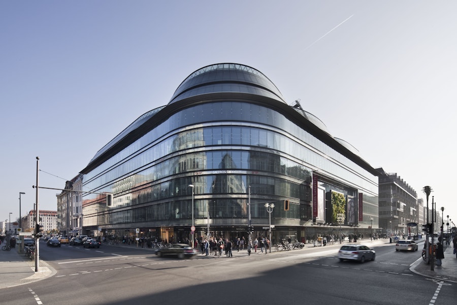
The Galeries Lafayette, by Jean Nouvel, was one of the main buildings in the effort to bring Friedrichstraße back to its glory days. The street used to be a luxurious shopping street, later a mixture of regular housing blocks and wasteland from the Wall. After the reunification of Germany, the region was one of the first to suffer the gentrification creeping throughout former East Berlin. Today, it is a shopping street, where rents are high, and tourists are many.
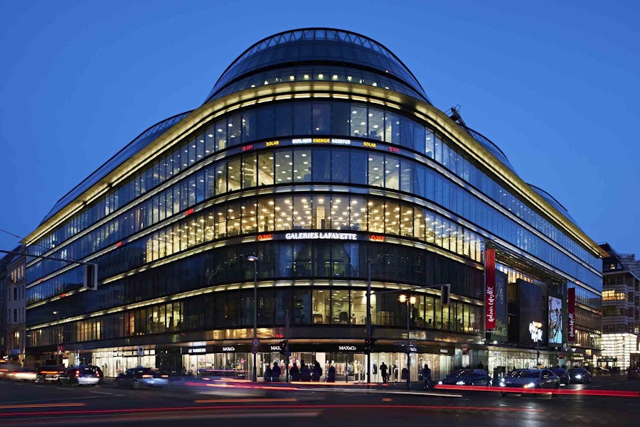
The building, despite all its meaning and consequences, is quite nice. It is a contrast to its contemporary neighbors, ditching the stone and metal austerity in favor of glass, transparency and rounded edges. The glass facade, during the day, is almost a mirror. But during the night, it lights up revealing its interior. That’s where Nouvel tried to create exciting spaces throughout the building: twelve transparent cones cut through the shopping floors, providing light, organizing circulation, and creating visual connections throughout the building.
Some of these cones are quite impressive, such as the main one and its sheer size, leading from the ground floor all the way up to the roof. Like a “circulation vortex,” as the architect puts it. Yet some resemble giant waste bins: full of small trash thrown in by visitors. Not much of a sight.
After checking out Nouvel’s building, we’ll head north, cross the S-Bahn tracks and visit Max Dudler’s library. It is technically not in Friedrichstadt anymore, as its northern border is on the train lines. But we are still following up Friedrichstraße, the central spine of the neighborhood.
Jacob and Wilhelm Grimm Center / Max Dudler
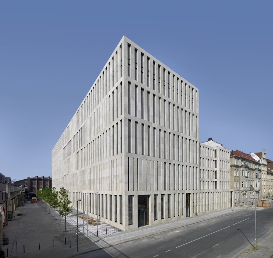
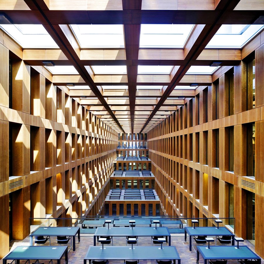
There are many libraries in Berlin, but this is the classiest. It belongs to Humboldt University and is the largest open-shelving library in Germany. From outside, it is an almost non-descript building, quite large and tall for Berlin standards, with a regular stone grid façade. Inside, a beautiful, tall, and long reading room, terraced and lit with natural light from skylights in the ceiling. The feeling is that of being outdoors. The whole library develops around this reading room, from the long entrance foyer to the reading niches and rooms on the upper levels.
Boros Collection / Realarchitektur
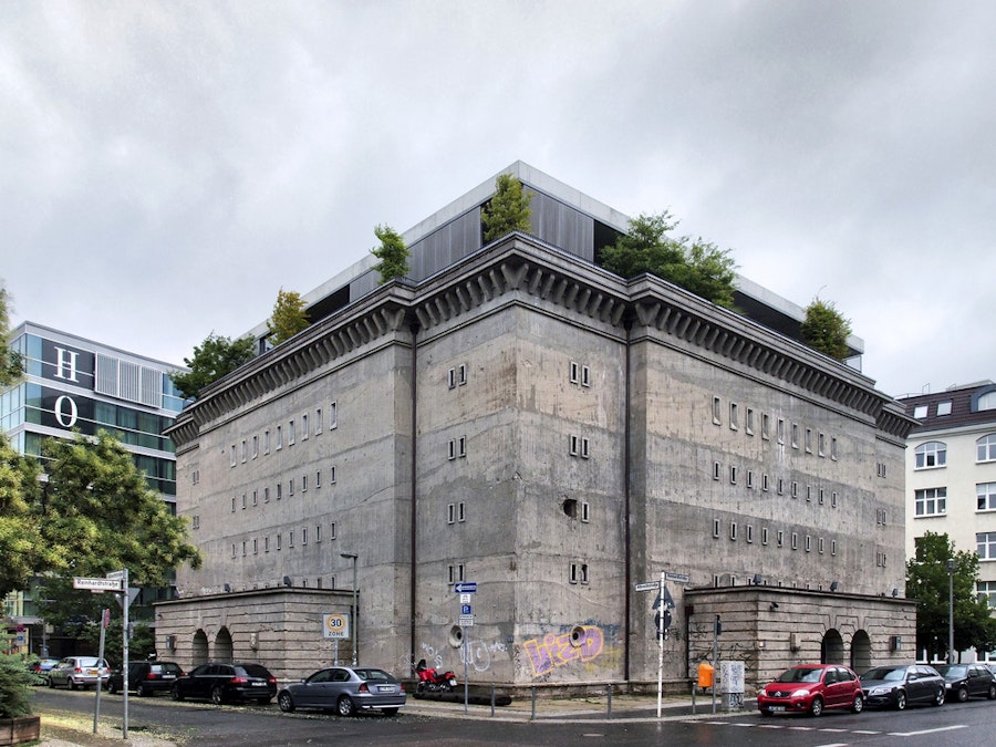
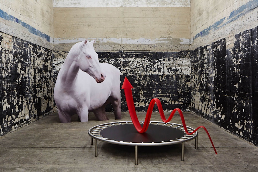
When I first visited this place some years ago, I was in shock. It is a huge concrete bunker, built during the Nazi regime to house over 3000 people in the case of air raids. After the war, its uses were diverse and colorful: from a banana storage to techno parties. It was shut down for good in 1995. German art collector Boros finally bought it and renovated it to store both its collection as well as its family (in a rooftop mansion, at least). The architects carved through 1.8m-wide walls and a 3m-thick ceiling to create over 80 rooms of different sizes while keeping the original bunker feeling. You can find spaces from one to three floor high which still wear the traces of their past, graffiti walls, bullet holes, and painted concrete.
The best part of it all is that Boros also opened the bunker for visitors, who can enjoy seasonal thematic exhibitions throughout the varied spaces of the building. The experience of entering this mastodontic building, feeling the chilled air inside, and circulating through its maze-like corridors and rooms adorned with contemporary art installations, is otherworldly.
Boros’s house is obviously out of bounds for the average visitor. From the street, you can spot the trees which give the bunker a slightly warmer feeling. But, judging by the photos, the warmth pretty much stops on the trees: his mansions contains as much concrete as the bunker on which it stands. You have to make reservations in advance, and the spots are limited. Sometimes you won’t find a free appointment in weeks.
